Do you have a hard time choosing paint colors? Have you ever had to repaint a room because the paint color you chose did not look at all how you thought it would? Choosing the wrong paint color is one of the most common decorating mistakes people make. Here’s how to choose paint colors you’ll love every time!

It can seem like a huge task to choose a paint color, especially if you’ve ever spent hours rolling paint onto the wall only to realize it’s just not the right color at all.
I often say “It’s just paint” and it can be painted over, but paint costs more than it used to along with everything else. I do feel your pain, because of the time and money lost when that happens.
I’ve chosen the wrong color paint too in the past. In fact, when we moved to this house, I repainted our master bedroom three times because I was rushing and didn’t remember my own advice.


But I finally learned how to avoid making paint mistakes, and I want to share that with you so that you can choose paint colors confidently in your home.
How to Choose Paint Colors
Here are my five tips or rules for choosing paint colors like a pro!
1. Don’t choose your paint colors first!
My number one tip is don’t choose your paint first.
I know sometimes you feel like you should go and choose your paint color first because it takes up most of the space in a room. The walls are huge. It takes up a lot of space, but it’s far easier to choose one of the thousands of paint colors to go with the other things in your home than it is to choose those things – furniture, decor area, rugs, things like that – to go with a paint color.

So always choose the big things first – the flooring, the furniture, the area rugs, the curtains, and the art even – choose those before you choose the paint color.
2. Learn at least a little about undertones
My second tip is to learn a little bit about undertones and color temperatures.
Paint is made up of different colors. If you’ve ever watched them mix it at the store, you can see all the different colors of paint being dripped into the can.

Those create undertones or color temperatures.
- A warm paint will have a color or undertone of a warm color, such as yellow or red.
- A cool paint color will have a base color or undertone of a cool color like blue, green, or even gray.
You can test the undertone of a paint color in two ways, so if you like a color, try this:
Place one or two swatches on a white piece of printer paper and see what color becomes really visible to you.

(This works especially well with white paint colors. Go check out my other blog post to see how to choose white paint colors.)
Anyways, the second way is if the paint color is on a swatch with more than one color, look to the very bottom color. It will usually be much more saturated and therefore will show more of the true color undertones, whether it’s cool or warm, yellow or pink, or any of that.


When you can see the undertones in a paint color, it makes it easier to choose one that will work in your home with your decor.
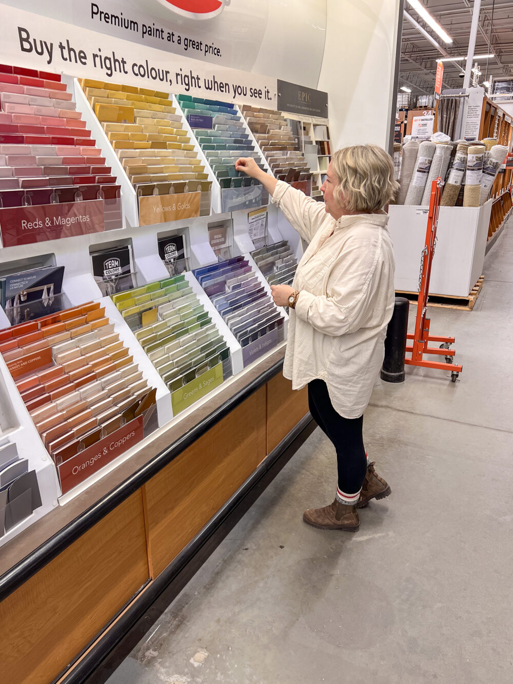
3. Never choose your paint color at the store (NEVER!)
My third tip is to never, ever, ever, ever choose paint colors at the store, ever.
There’s a story that I hear all the time. Someone goes to the paint or hardware store, itching to do a makeover on a weekend, wanting to buy paint to start that makeover. (Mistake number one!)
They have a general idea of the color they want – maybe a green, or a blue, or a red, or a yellow – but they’re not exactly sure of their exact paint colors yet.
So they go to the Home Depot, Lowe’s, the paint store, whatever.
After some hemming and hawing, while they’re standing there looking at all the options, they choose a color that they think they love and get a gallon (or two, or three) mixed depending on the size of the room.

They are so excited to get that paint home and get that weekend DIY underway.
But…
Oh my goodness, the but...
But when they get home and start painting, the paint doesn’t quite look like it did at the store. Something is very different.
The reason for that is that they broke the BIGGEST rule, the biggest tip I have, even though this comes third on my list:
Never ever, ever, ever choose paint colors at the store.
When we pick a paint color at the store, it’s usually under what kind of lighting? Fluorescent lighting – harsh and glaring, and very different than you’re likely to have in your home.

That lighting, that harsh fluorescent lighting, changes the way that paint color looks to your eyes in the store and how you see those undertones that we talked about already.
The paint color you chose at the store will simply never look the same once you get it into your home, so never choose the paint color at the store.
4. Use an inspiration piece
My fourth tip for choosing paint colors is to try an inspiration piece.
One of my favorite decorating hacks, especially for beginners, is to choose colors for your home pulled out of an inspiration piece. That can be a piece of fabric you plan to use in the room, some bedding you plan to use in the room, an area rug, a piece of art, or any of that.

When you pull colors from that, you know that they will coordinate with everything else in the room.
This is especially true of a paint color, so try pulling a paint color out of an inspiration piece.
5. Use the largest test swatch possible
My fifth tip for choosing paint colors is to use the largest test swatch possible and test at home with accurate lighting.
Pick up the largest swatches you can. Some stores have really big ones. There are also places online like HelloPaint.ca where you can order stick-on paint swatches in the color that you choose. Or you can get sample size testers and paint them onto a Bristol board and put those on the wall.
With your large paint swatches or your painted Bristol boards, look at all those large samples in all kinds of light. Even move them around the room if you need to see what they’ll look like on different walls and see how they look in your space.
The lighting in the room – lamps, ceiling lights, anything like that – plus natural lighting from windows will change how that paint swatch looks at different times of day.
So live with those large swatches for a couple of days in all the light to see if you genuinely like that color.
The larger the swatch, the easier it will be to determine which paint color looks best in your space.
Different Rooms and Natural Lighting
If you’re in North America:
- South-facing rooms will tend to have warmer light due to the sun coming in every day. The natural light will be a yellowish-white light and may wash out some colors. Even still, most paint colors will work in a room with southern exposure, but a cooler color may be preferred. To balance out the yellower lighting.
- North-facing rooms will have cooler blue or gray natural lighting for these spaces. You can use a cool color, but it may seem even cooler and more blue, gray, and chilly than it would in another room. That’s what happened in my master bedroom. It’s a north-facing window with a pool in the backyard, so the lighting reflects very, very cool in there. A warm paint color will probably be preferable in a northern-facing room.
- East- and west-facing rooms will either have warmer cool lighting depending on the time of day as the sun goes over the house, so you could use either warmer cool colors in an east or west facing room.

Summary
Choosing paint colors doesn’t have to be quite so painful if you follow these simple tips:
- Don’t choose your paint color first. Make sure all your other decor is chosen before you choose your paint color.
- Remember, the paint is made up of several base colors and those will show through in what is called undertones. If you can identify the undertones in a paint color, you’ll be better able to choose one that works with your decor.
- Never choose a paint color at the store because the lighting there will always be different than it is at your house. Always. So never ever choose a paint color at the store.
- Lighting changes how paint colors look, so always test your paint colors at home, in the room you’ll be painting, and look at it in different lighting at different times of day, before committing to painting the whole room.
- And if you’re stumped on what paint color to choose match colors to an inspiration piece like an area rug, a piece of art, or a fabric you love and are planning to use in the room you’re painting.
These tips will make choosing a paint color so much easier.
Prefer to watch?
Related: How to Choose the Right Paint Sheen for the finish that’ll actually hold up.
Have you ever made a paint color mistake? How did you fix it? I’d love to hear about your paint mishaps and solutions in the comments below!
P.S. Once your paint’s picked, head to my full decorating guide → for what comes next.

Want to see more content like this in your Google searches?
This button tells Google that Home Made Lovely is a source you like, so it can show you more of it.
I have always done this. I actually tell people standing there to take it home check the color. It will even look different outside. They always say thank you i didn’t know that. My problem is my bathroom. I live in an 814 sq foot home. My bathroom is so tiny. I know i have to keep it light. The color in there now i inherented,when i bought the house.
A lot of people don’t know, or get rushed and think it won’t matter. You can keep it light and bright, just bring paint swatches home to look at it the bathroom light.
When I worked in a paint store, I always told people to do this. We even had canvas boards that we painted ourselves with the most popular colours on it so that we could bring them over to the natural light coming in from the windows to show customers. I’ve heard of so many horror stories where people either did not listen to the consultants or didn’t ask; walked in, looked at a paint colour, loved in in store, bought it, painted it and then hated it. The other key element to painting is to always choose your paint colour last. There are millions of hues in the world and yet only so many flooring tiles, slats, furniture choices, patterns, etc. but there is a wide variety of colours and manufacturers!
Yup! Totally agree!
Question! I’m putting beadboard up in my bathroom. I want it painted with flat paint. My remodeler is arguing with me that it needs to be semi-gloss as that’s what’s recommend for bathrooms. I don’t like shiny at all! What’s your opinion?
You can get bathroom paint in just about any finish. The key is to make sure that it’s mold and mildew resistant. I’m with you on not wanting sheen at all. But just keep in mind that if you get flat paint and the beadboard isn’t completely smooth, it may collect dust a bit if the room is damp. Our shiplap is a little rough in spots and those spots are a little trickier to wipe the inevitable dust off of. But I think you can totally get away with flat bathroom paint!
Hi Miss Shannon! This post makes me so happy!! I know we can get in a rush and want to pick a color and slap it on the wall and be in love with the end result! This is a fairy-tale that won’t ever come true! My poor husband know’s I’m up to something when he come’s home to 12 samples taped to the walls and 100 more spread all over every flat surface! It often takes me weeks to finally commit to the right color, only after re-positioning them, staring at them, tilting my head from every corner in the room, just to be sure… We’ll be watching a movie, and he’ll catch me staring at the paint samples on the wall, rather than following the plot on the screen! Such a fun journey!! Now a tip from my husband: Don’t let me pick out paint when I’m pregnant! So many regrets…. lol.
It is a fairy tale, without a happy ending in real life! Oh and I don’t choose colors when I have PMS either. Never like the result! Lol.
Thank you so much for your help…and with a swift reply. Now I’m off to look at your posts on your blog!!!
🙂 Yay!
Could not agree more!! There are so many hues and shades that look different in the light. My sweet husband repainted all the trim including chair rails because the white was just too yellow.
Yup. I need to do that in our new house too.
Hi! Do you know what’s the paint color of the wall in the photo of the bedroom you show in this post? It really is beautiful. Thanks.
Yes, it’s Sherwin Williams Analytical Grey. All of our paint colors can be found here: https://homemadelovely.com/home-paint-colors/
This is PERFECT timing for me…Just starting to decorate a new (to me 🙂 ) home.
I will definitely use this info!!
Can you please advise where the beautiful “may the Lord” scroll came from .. geez I love it!
thank you for all you do!!
Kim
Hi, Kim. I’m so glad it’s such perfect timing! Yay! The scroll was from Smallwoods Home but they don’t seem to have it anymore. I’m not sure why, but I’ve put in a request to find out. I’m sorry!
My-my, this post is so for me. All to often I go to the hardware store, then to the paint department/paint chip strips to choose paint color. In the store, it appears to be perfect, but once I get it home and put the paint on the wall, I just want to cry. Thanks to your tips, I have a new weapon to help me choose the color I am seeking.
Thanks for sharing, and please stay safe!
I’m so glad it was helpful, Ivory!
I’ve been wanting to go for black matte walls for my interior painting for years. I know it can be overwhelming to have dark colors, so I always bet on white and pale ones and maaaybe just one wall. Looking how you create contrast with more of them painted in dark blue or so helped a lot! Will definitely give it a go! Thanks 🙂
Changing the exterior house color was overwhelming but I found the right paint by purchasing sample sizes, painting them on one wall and checking the color at all times of the day and evening, clouds, full sun, etc. It took lots of samples but finally got the right shade!
Yes, some spaces are harder than others to get right!
Thank you for these helpful tips! What color should I paint oak bookshelves that bookend a red brick fireplace? The wall color is a tan/toupe in certain light which I want to change but don’t know what color. The carpet is tan and trim is oak. Built in the 80’s 🙂
I never knew picking a paint color would be this hard!
Hi Shannon – appreciating all your tips on choosing the right wall color. After living 30 yrs in a bungalow with small closed off rooms, we’re now in an open floor plan house with the living, dining and kitchen making an L shape. I love the open feel. However, I want the same wall color for the whole space, and it is driving me crazy. I’m probably my own worst enemy; I may be trying too hard but I just want to get it right. The lighting/undertone issue has me stuck. Your tips are bringing me some clarity. Thanks!
I’m so sorry you’ve been stuck – but glad that you’re getting some clarity now!
The information that you published here will be quite useful. Appreciate all the efforts that you have put here.
Hi Shannon, love your advice. Was wondering your thoughts as we have honey oak cupboards in kitchen, have to replace our counter as well as the floor at some point. What colour of paint would go with the cupboards, or do you suggest I paint them? The rest of house is a greige colour. I am horrible at making these decisions and wondered if you would advise me, please.
Hi Bonnie,
I would recommend that you take a look at our comprehensive, do-it-yourself decorating course, Decorating Uncomplicated! It will have everything you need to help you pull together colors and all those design decisions that you might struggle with!
https://homemadelovely.com/decorating-uncomplicated/
This article on choosing paint colors is a fantastic resource! I appreciate the detailed breakdown of the color wheel and how understanding the relationships between colors can help create a cohesive look throughout a home. The emphasis on considering the mood and atmosphere you want to achieve is especially important; it’s amazing how much a color can influence our emotions in a space.
I also found the section on testing colors with swatches to be particularly helpful. It’s a great reminder that lighting can drastically change how a color appears. Your tip about looking at colors in both natural and artificial light is something I hadn’t considered before and will definitely implement in my next project.
As I’m planning to refresh my home exterior, I’d love to know your thoughts on how to balance popular trends with timeless choices. How do you suggest homeowners navigate the often fleeting nature of color trends while ensuring their choices remain relevant over time?
Thank you for your feedback, Matt! I think for big jobs that either take a lot of time or money or both, timeless is the way to go. Popular trends should only ever be implemented in low-commitment places so that you don’t regret the choices in a few years when the trend inevitably goes away!